Brand-Aligned Spaces
UTN China Exhibition Stand | Overall Branding
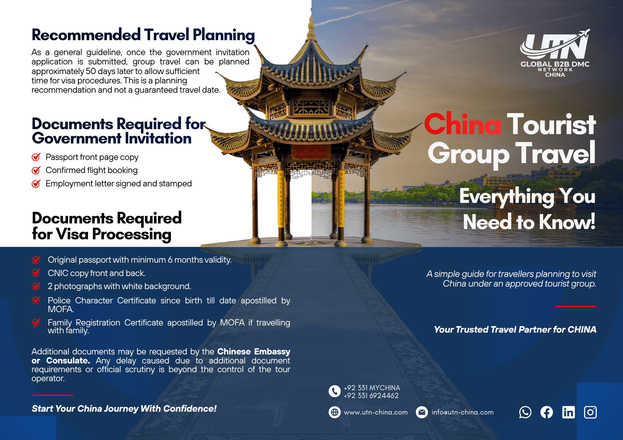
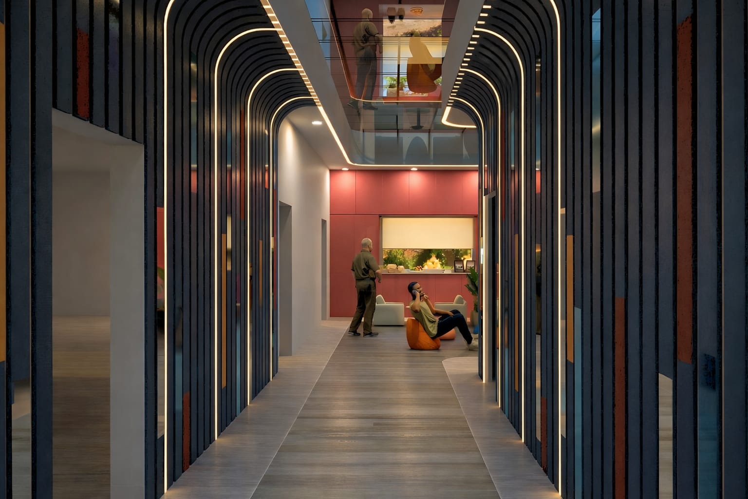
This project involved the conceptualisation and branding of an exhibition stand for UTN China, designed to promote China as a travel destination. The stand is currently in the pre-construction phase, with the design developed to a level ready for fabrication and execution. The goal was to create a visually striking, culturally immersive, and functionally efficient booth that attracts visitors while clearly communicating UTN’s services.
Role :
2025

1. Objective & Strategy
Design a compact yet impactful exhibition stand
Reflect Chinese cultural identity in a modern, professional way
Create strong visual branding across physical and print media
Ensure the design is practical, buildable, and visitor-friendly
2. Concept & Visual Identity
The concept is inspired by traditional Chinese architectural elements, particularly the iconic curved roof forms, reinterpreted in a modern exhibition context.
A balance was maintained between cultural expression and corporate branding. The red structural frame represents Chinese heritage, while the blue graphics establish a professional and trustworthy tone.
Lighting and graphic hierarchy were carefully considered to emphasize key messaging such as “Explore China” and reinforce brand visibility.

3. Spatial Planning & Experience
The stand follows a clean and efficient layout:
Open frontage for accessibility and visibility
Central reception desk as the primary interaction point
Branded wall panels for communication and digital integration
Overhead canopy for strong visual identity
The space is designed to ensure smooth circulation, encouraging engagement while maintaining clarity and openness.
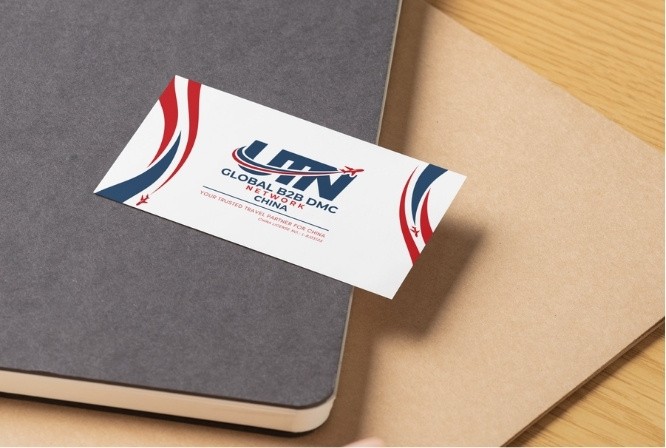
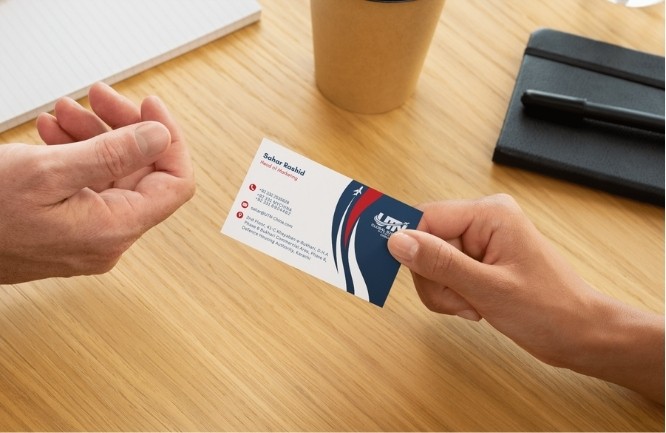
4. Branding & Deliverables
A cohesive branding system was developed across all touchpoints:
Exhibition stand graphics
Brochure (China Destination Management & Travel Guide)
Promotional flyer
Mobile-friendly visual layouts
The use of skyline imagery, consistent color palette, and clear typography strengthens brand recall and creates a unified visual language.
More Projects


Brand-Aligned Spaces
UTN China Exhibition Stand | Overall Branding
This project involved the conceptualisation and branding of an exhibition stand for UTN China, designed to promote China as a travel destination. The stand is currently in the pre-construction phase, with the design developed to a level ready for fabrication and execution. The goal was to create a visually striking, culturally immersive, and functionally efficient booth that attracts visitors while clearly communicating UTN’s services.
Role :
2025
1. Objective & Strategy
Design a compact yet impactful exhibition stand
Reflect Chinese cultural identity in a modern, professional way
Create strong visual branding across physical and print media
Ensure the design is practical, buildable, and visitor-friendly
2. Concept & Visual Identity
The concept is inspired by traditional Chinese architectural elements, particularly the iconic curved roof forms, reinterpreted in a modern exhibition context.
A balance was maintained between cultural expression and corporate branding. The red structural frame represents Chinese heritage, while the blue graphics establish a professional and trustworthy tone.
Lighting and graphic hierarchy were carefully considered to emphasize key messaging such as “Explore China” and reinforce brand visibility.
3. Spatial Planning & Experience
The stand follows a clean and efficient layout:
Open frontage for accessibility and visibility
Central reception desk as the primary interaction point
Branded wall panels for communication and digital integration
Overhead canopy for strong visual identity
The space is designed to ensure smooth circulation, encouraging engagement while maintaining clarity and openness.
4. Branding & Deliverables
A cohesive branding system was developed across all touchpoints:
Exhibition stand graphics
Brochure (China Destination Management & Travel Guide)
Promotional flyer
Mobile-friendly visual layouts
The use of skyline imagery, consistent color palette, and clear typography strengthens brand recall and creates a unified visual language.
More Projects
Brand-Aligned Spaces
UTN China Exhibition Stand | Overall Branding
This project involved the conceptualisation and branding of an exhibition stand for UTN China, designed to promote China as a travel destination. The stand is currently in the pre-construction phase, with the design developed to a level ready for fabrication and execution. The goal was to create a visually striking, culturally immersive, and functionally efficient booth that attracts visitors while clearly communicating UTN’s services.
Role :
2025
1. Objective & Strategy
Design a compact yet impactful exhibition stand
Reflect Chinese cultural identity in a modern, professional way
Create strong visual branding across physical and print media
Ensure the design is practical, buildable, and visitor-friendly
2. Concept & Visual Identity
The concept is inspired by traditional Chinese architectural elements, particularly the iconic curved roof forms, reinterpreted in a modern exhibition context.
A balance was maintained between cultural expression and corporate branding. The red structural frame represents Chinese heritage, while the blue graphics establish a professional and trustworthy tone.
Lighting and graphic hierarchy were carefully considered to emphasize key messaging such as “Explore China” and reinforce brand visibility.
3. Spatial Planning & Experience
The stand follows a clean and efficient layout:
Open frontage for accessibility and visibility
Central reception desk as the primary interaction point
Branded wall panels for communication and digital integration
Overhead canopy for strong visual identity
The space is designed to ensure smooth circulation, encouraging engagement while maintaining clarity and openness.
4. Branding & Deliverables
A cohesive branding system was developed across all touchpoints:
Exhibition stand graphics
Brochure (China Destination Management & Travel Guide)
Promotional flyer
Mobile-friendly visual layouts
The use of skyline imagery, consistent color palette, and clear typography strengthens brand recall and creates a unified visual language.